

The brief was to update the KFC digital CI to convey a much more homely environment, and to create a richer experience for the user. The redesign had taken roughly 8 months from concept to execution, with the final creative presentation to client was shown with the look and feel seen below.
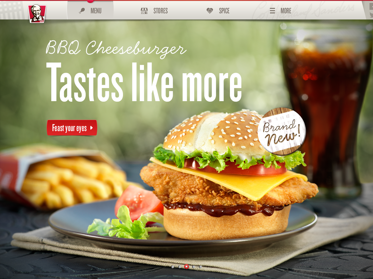
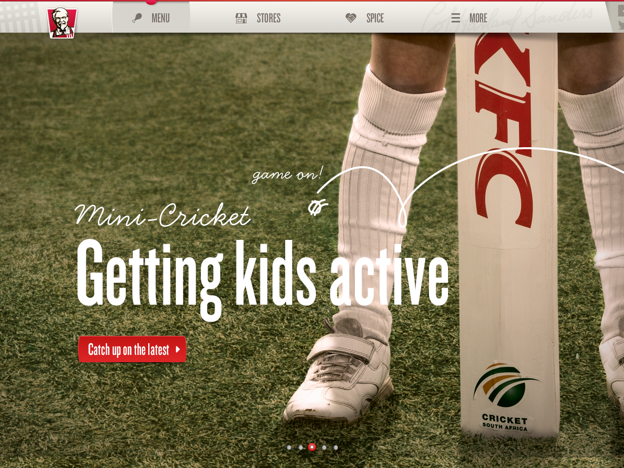
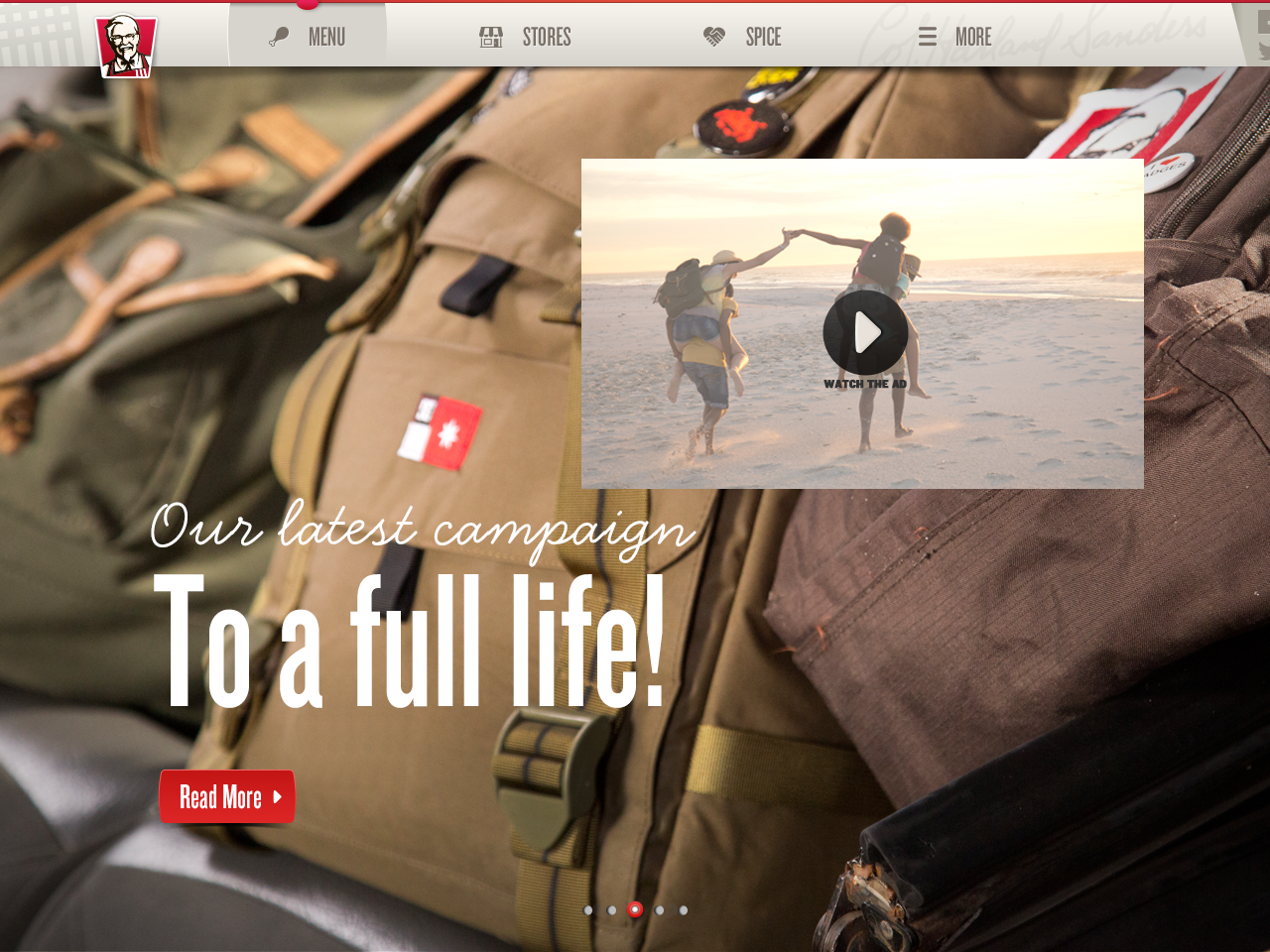
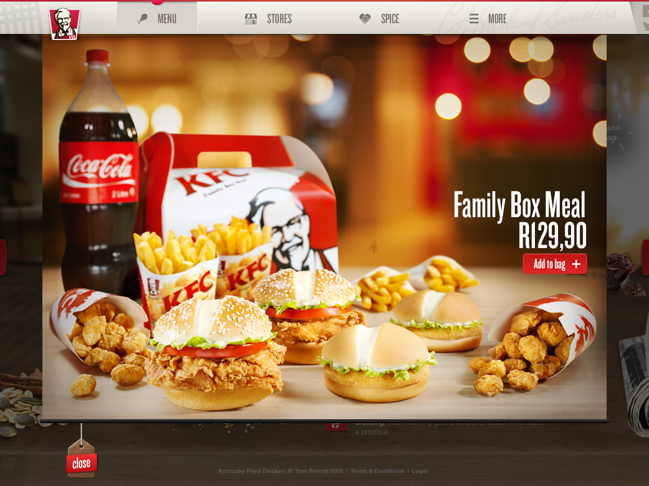
Landing Page:
The focus of the website was changed from campaign showcase to display the food first. Large in-situ imagery was used to help convey the "at-home" nature of the items on display.
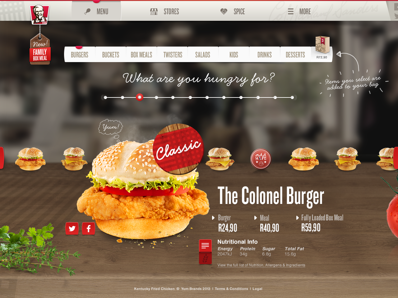
Menu:
Navigation of the foods worked with the scrollbar or the buttons on the sides. Users could also swipe on touch screen devices.
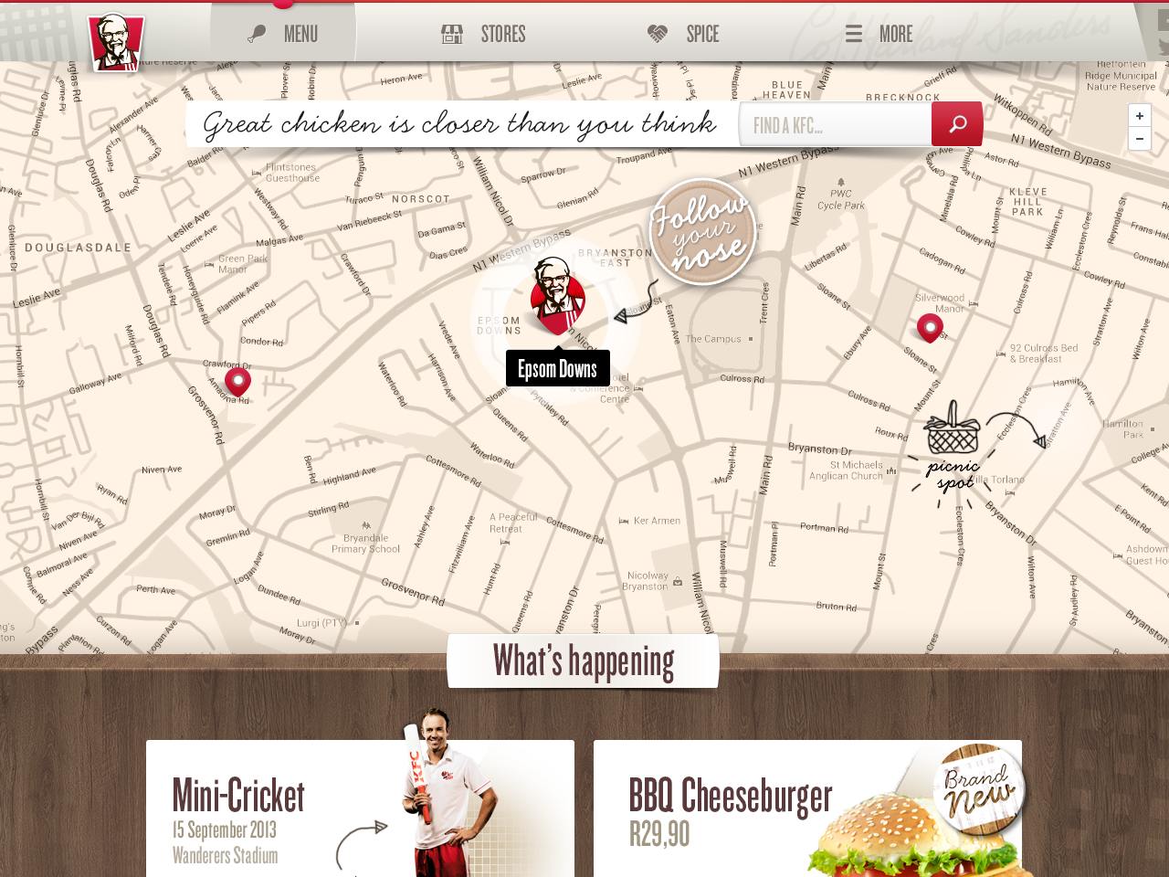
Store locator:
The map was styled to the warmer colours of the KFC palette. The closest store would be identified first, and users could either click on the thumbnail to read more, or search for another store.

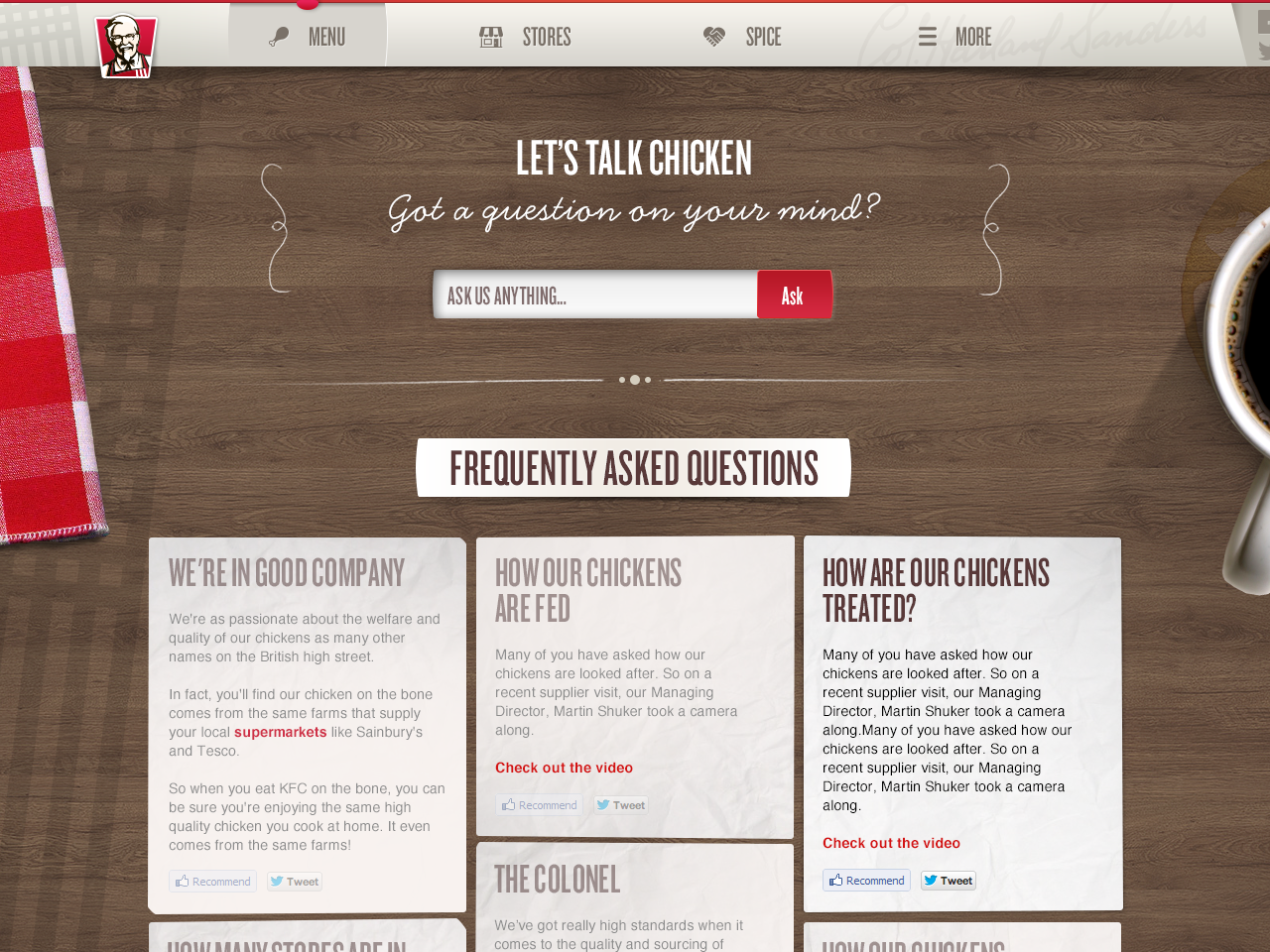
FAQ:
Customer service normally gets swamped with customer concerns, so we created a page to house commonly asked questions. KFC.co.uk implemented a similar approach that we styled for the new look and feel.
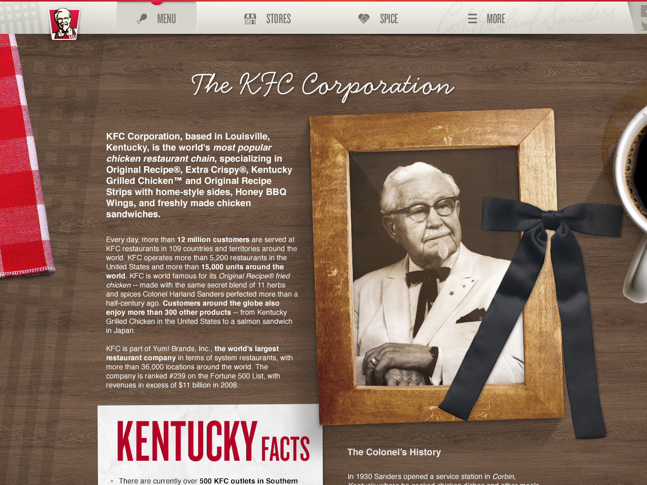
Generic Content Page:
Once we had established a "top-down" view for some of our more content heavy pages, we followed it through as a template for the remaining content pages, custom styling them depending on the content.
Agency: OgilvyOne Johannesburg
Client: KFC
Executive Creative Director: Dylan McLean
Creative Director: Marcel Rossouw